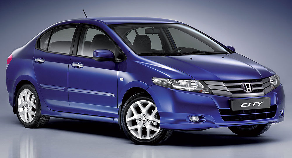

 While the design of the City is not perfect, it�s way better looking than the odd hatchback with a boot slapped previous generation City. It�s also got a more classic sedan look to it with none of that A-pillar triangular window stuff. A sports sedan to be exact. I still like the shape as much as I did when I first saw it on the spyshots on the internet, especially the white one transported in China. It�s just too bad Honda isn�t offering the car in white here, in fact there are no white Hondas on sale except for the Type R, but I was told white is being added to the CKD paint process soon.
The top of the line model gets foglamps but I kind of prefer the bumper without the foglamps as somehow it helps make the car look wider and shorter. Chrome for the door handles are a nice touch, while the fuel lid opens up with just a touch much like more pricey European cars.

No comments:
Post a Comment